

I feel a bit guilty, not having posted for some time, but not having the sanctity of my study nearby did that to me. And travel. I’ve been back a couple of days from a trip to Tasmania and Melbourne, Australia. Tasmania was new to Kerry and I, but not Melbourne, as we have visited often because of family and friends who call it home. The whole trip was eclectic, including the changes in weather and temperatures. Looking at different land forms, buildings, creatures and art. I still feel a little unsettled, but let me begin with some art that we saw.
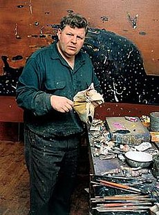
The first day in Melbourne was sunny and saw us walking around the neighbourhood of Fitzroy North. Always interesting, because of the difference between our two countries. Here, the buildings are old, terraced houses mostly, reminiscent of Europe. Goodbye to the only fine day we struck there. But good does sometimes come from bad, and that came in the form of art. I’ll take you the last art gallery we visited on our trip, into Melbourne city and to the Ian Potter Centre (part of the National Gallery of Victoria) where drawings from Australian artist Fred Williams were on display. Williams (1927-1982) is well-known in Australia for his large modernist paintings, with daubs and dashes and fleeting movement depicting the Australian landscape in a most evocative way.
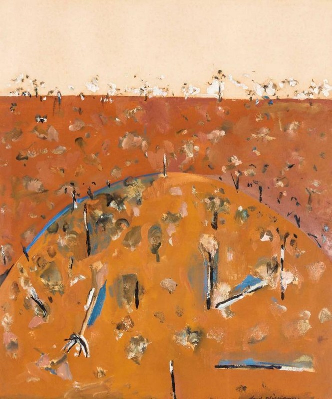
This is the style of work Williams was best known. He painted often en plein air.
The works in the exhibition I went to are from the time he studied in London during the 1950s. These works blew me away. There were more than 50 drawings and sketches. Most sketches were executed in conté crayon, using orange and black in the main, but some had a light grey wash in parts. Unfortunately I can show only a few of the images I saw (I had assumed Kerry was taking photos) and could not locate more for this post as I’d hoped. I did however find one of the period executed in black conté, which is typical of the style of many in the exhibition; gestural and loose, yet accurate. He captured the shape of people, scenes and animals with deft, fleeting strokes, that showed his skill in bucketloads. You can view more in a review put out by The Conversation. Do take a look. I am kicking myself for not purchasing the exhibition catalogue. I may yet order it.
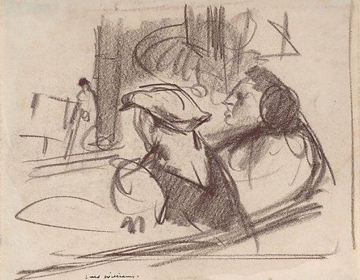
Conté is a mix of compressed graphite and charcoal, combined with a base of wax or clay. With conte, a mark cannot easily be erased, and its mastery comes through constant sketching. I used to use conté some years back for general and figure sketching. It is a medium one needs patience to master.

Here is a sketch I did in brown conté some years ago.
Apologies for not being able to provide the range of sketches I’d hoped to share from Fred Williams.

It looks like it was a great exhibition and sounds like it was a good trip!
LikeLike
It was a good trip. A nice blend of being with friends and family, while enjoying artistic pursuits.
LikeLike
Thank you for introducing Fred Williams to me. Beautiful colours. Your sketch is so sensitive. The play with thin and thicker lines combined with those vague facial features make the figure quite mysterious.
LikeLike
Nice to hear from you. Once I have the catalogue for that exhibition of Williams’ work I shall write a more comprehensive post.
LikeLike