I am sure that most of you find that some situations get in the way of a commitment you made to continue working on a project come what may? Well, that’s me folks! Yes, I have been procrastinating about getting stuck in to my art work, and I apologise to those who may have been waiting to see progress on my Memoir in Pictures (a working title). I’m only a few pages along from when I last wrote about the book, although I have made some inroads as to how I wish to present my pages, and to execute the finished product – as in taking it from scruffy pencil sketches to the finished product.
Trying to discover why I had persisting pain around my mouth, head, et al. I went to see a doctor, a dentist, a jaw chap, a periodontist and a physiotherapist. After many months I had a scan to look at my sinuses, to find a large cyst was blocking my nasal passage. After fourteen months, from when I began this path of discovery, I am now booked in for an operation. To say that I’m not looking forward to having my nasal cavities explored is an understatement. Still, through all this annoying daily pain, I decided to find things which would take my mind off, well, myself.
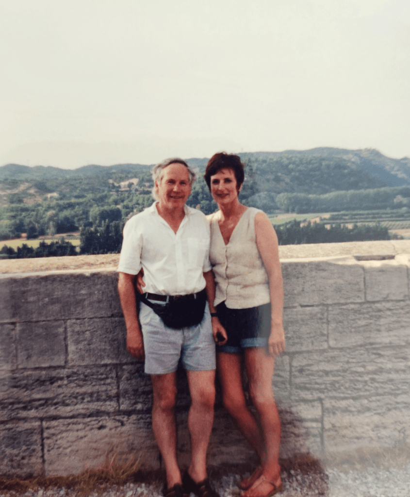
I had read about an art residency in the French countryside, which appealed greatly, as Kerry and I had stayed in the area a long time ago, and loved it.
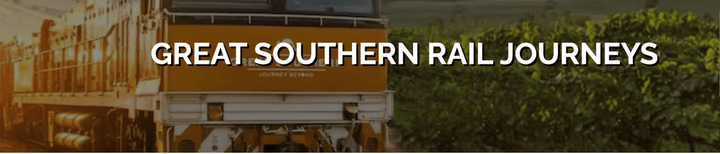
I have been absent from my computer and drawing board, as I was out of the country on a short train sojourn from Brisbane to Adelaide, though I did have sketching on my mind. Well, more the potential for later sketches, as it would have been impossible to get the scenery down on paper as the landscape whizzed by. Fortunately I found that my phone camera could capture with technology that which I couldn’t by hand, and the shots I took of the landscape out the window turned out better than I imagined they might.
Our introduction to others at the meeting point in Brisbane was superb, with breakfast awaiting, complete with live music to accompany the event. Kerry and I climbed aboard the Great Southernanticipation rising, as we were to be spending three nights on this train. Many buses were lined up to feed us to the train, which was incredibly long, to cater for the three hundred plus people who were heading off on this adventure. I learned early on that being in a Gold carriage was lower down the scale of ‘class’ than I had imagined, as Gold Superior and Platinum won the top honours. Still, our cabin was fine, and the dining car and lounge the same. The staff were great, as was the food and plenty of nice passengers to talk with.
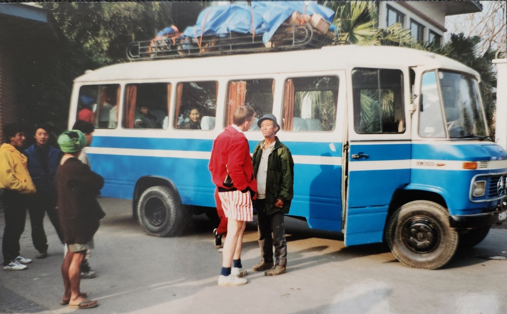
Preparing to leave Kathmandu with Head Guide F’dorje.
Looking back, it seems, becomes more common as the years advance, for when I read of a blogger friend’s adventure to Nepal in 1982, I was immediately transported to my own travel experience in 1992. Early that year I read an advertisement for small group walking tours in the foothills of Mt Everest, Solukhumbu, Nepal. It so appealed; lots of walking, wonderful scenery, a different culture, this was for me! And, I should add, this would be my first trip overseas. I wrote to the company immediately, received the information, and three weeks later I landed in Kathmandu along with my walking buddies; Diane the leader, Jill, Annie and I – strangers until we met at Auckland airport! Note: Solukhumbu is the area where New Zealander Sir Edmund Hillary had built schools, hospitals and given other support, since he had famously scaled Mt Everest alongside Sherpa Tensing in 1952.
Hi to all. I do hope your Christmas break has been relaxing and you are once again immersed in your art, work, reading, or whatever moves you most. While our holidays are behind us here, there have been many disruptions to my intended outpouring of my art and writing project. I decided this week to give you some idea of why I’ve stalled on my most adventurous art project yet – a graphic novel. I decided to write myself back into this project, and here is some of what I wrote…
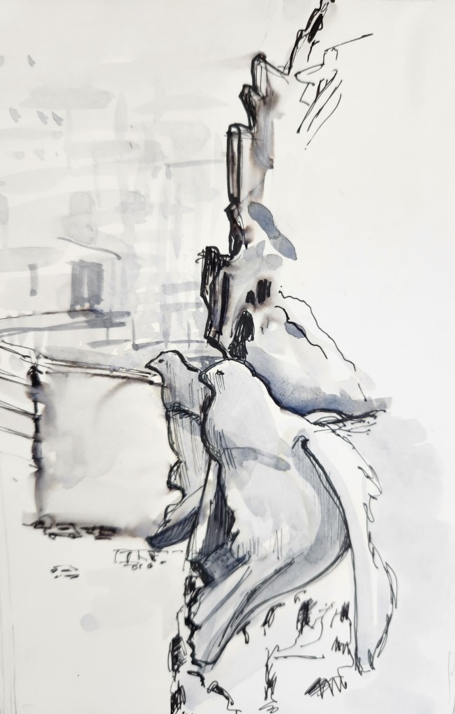
Last week I was reminded of my sketch trip to Spain in 2019, and I went looking for the sketchbook I’d used at the time. Previous to leaving, I’d joined a travel sketching group, and in preparation we were asked to choose something to sketch from a favourite place we’d visited. So I chose a photo taken twenty years earlier from the cathedral Sagara Família in Barcelona.
I was high in a tower which overlooked the city and focussed on the sculptured doves in front of me. I used water-soluble ink for the foreground. It’s wise not to load the brush with too much water when you pick up the ink pigment. I used a diluted watercolour for the background.
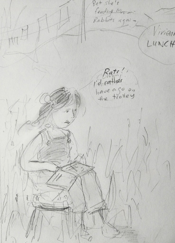
Last time I talked about my memoir with pictures, I showed a few pencil sketches of some pages I had nutted out. I have now sketched more pages, attempting to make a storyboard of the tales I wished to tell, or portray. This bit was easy. I love sketching in pencil and plotting scenarios based on my experiences when young, that was no trouble what so ever.
I studied other graphic novels to get a feel with how I wanted mine to look: a mixture of double pages in colour or black and white, and several pages with smaller images, as you might see in a comic, with speech bubbles etc., But then, I decided I should do at least one trial page in full colour as I imagined the larger pages should look. But, what medium to use?
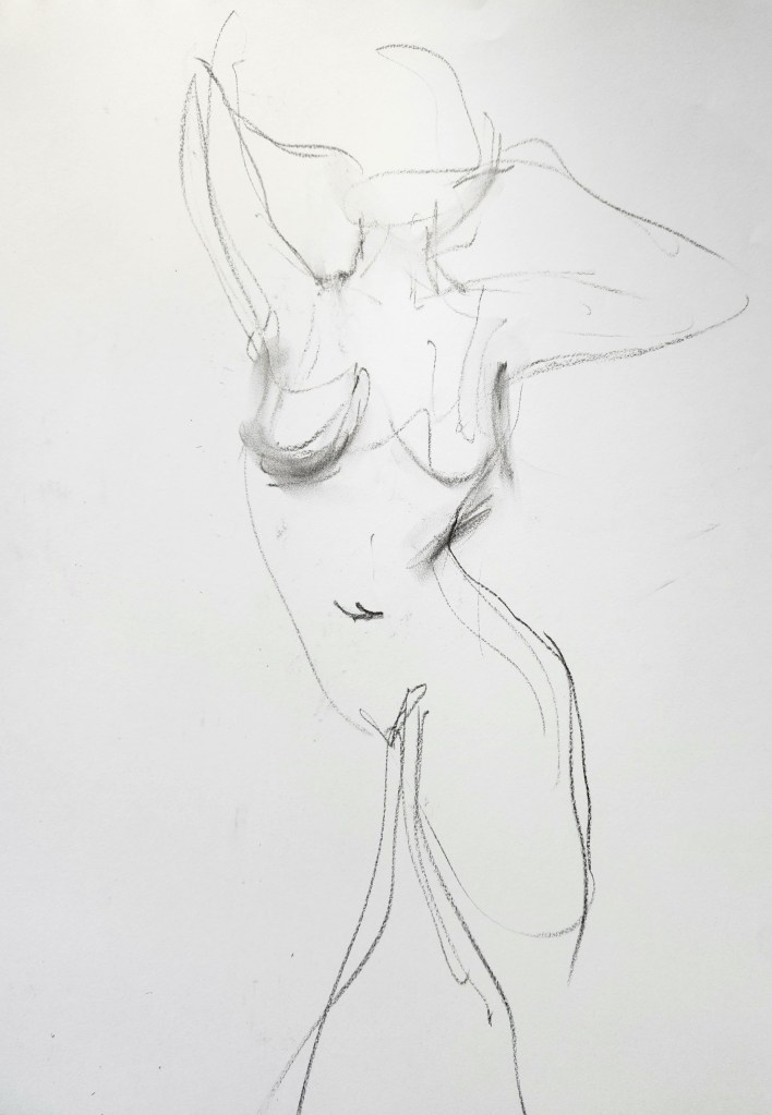
As I mentioned in my last post, Thursday would be the last of four Life drawing sessions held locally. Again we started with numerous quick sketches and we were encouraged to keep to pencil throughout. But I couldn’t resist using willow charcoal for a few the poses, as I particularly like the medium. I did use pencil, but it didn’t respond so well to the reasonably thick cartridge paper I had brought with me. The above poses were only a couple of minutes long, and are mere flashes of line on paper.
I went to my first Life Drawing classes aged fourteen with my dad. My brother and sister also attended at various times too. Dad was passionate about art and thought one of his children might catch the bug. However, I was the only one who ended up at art school, where I continued to sketch the figure. It was something I loved doing then, and have continued doing from time to time, ever since.
The above sketch was part of an exhibition of my figure studies completed that year. I hired a model, and worked in a studio above my garage to produce the work. It was great to have a comfy sofa the model could relax in, which resulted in many nice long poses. All the work sold, which was good, but when I realised I wished to keep one (the above image) for myself, on enquiry I found my agent had sold it that very day. Lucky I had taken a photo.
In last week’s post, I promised that you would see another sketch. Well, I did keep my word, and here it is, taken from a photo I took of the Cologne Cathedral on my recent travels. If you have followed my site, you will know I love sketching clouds, and that is why this sky over the Cathedral appealed to me. Nothing I like better than a great mass of brooding cumulus to get me going with the pencils.
I found little time while travelling up the Rhine to actually sit and sketch, though I did manage a few times. I have shown you the windmill sketch already, just outside Amsterdam. But here I show one sketched from my cabin as we moved closer to Basel and the finish of our cruise.
Beside the Rhine.
For this sketch I used fine pen, 6B pencil, and aquarelle pencil. I sketched swiftly across the two pages, getting this down in a matter of minutes, as dinner was ready to be served. I like using a darker pencil on a smooth paper (as this was), as I love rubbing the lead with a fingertip hinting at shadow or contour. I popped in blue and green to remind me of where I could lay a watercolour wash through at a later date. I never did the wash, but quite liked the immediacy of the sketch.
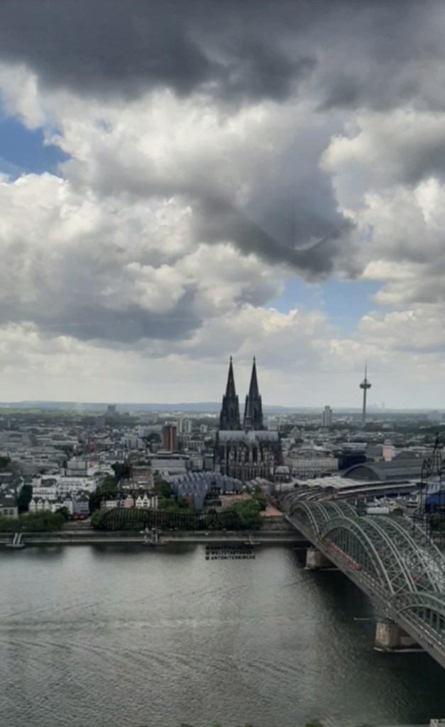
We continued our cruise through the night from Dordrecht, with me dreaming of the wonderful windmills we had seen in Kinderdijk that day. The ‘ship’ docked in Monheim at approximately 9am on Friday. Soon after we were on a coach and heading into Cologne where we would begin our walking tour. Our destination – the Cathedral. We needed to cross the bridge, you see in the photo, but so did zillions of others, and rather like we found in Amsterdam, the pedestrians had to fight with cyclists for the same space. I was surprised when the tour guide told us that we would likely be shouted at, or even sworn at by cyclists! And although I was never sworn at, the walk across the bridge was certainly memorable.
We continued our cruise through the night from Dordrecht, with me dreaming of the wonderful windmills we had seen in Kinderdijk that day. The ‘ship’ docked in Monheim at approximately 9am on Friday. Soon after we were on a coach and heading into Cologne where we would begin our walking tour. Our destination – the Cathedral. We needed to cross the bridge, you see in the photo, but so did zillions of others, and rather like we found in Amsterdam, the pedestrians had to fight with cyclists for the same space. I was surprised when the tour guide told us that we would likely be shouted at, or even sworn at by cyclists! And although I was never sworn at, the walk across the bridge was certainly memorable.
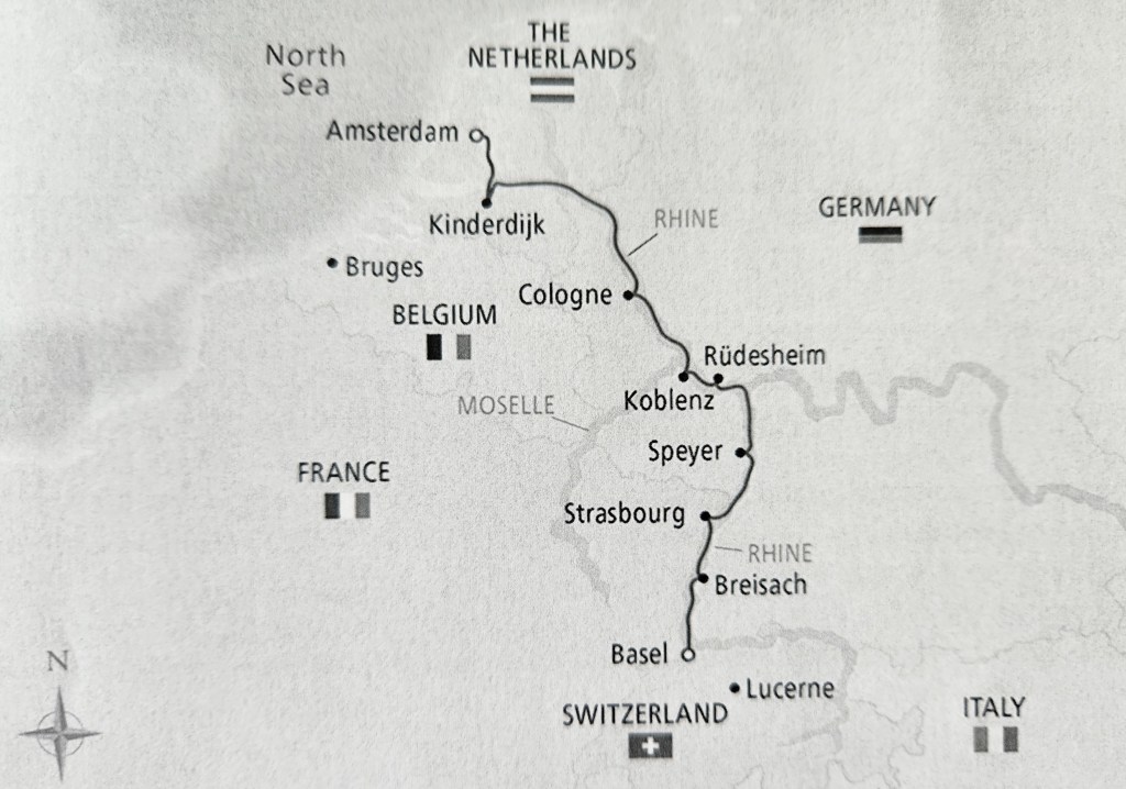
After joining the ship, we spent the first afternoon settling in to our cabins (named staterooms on board), and prepared to meet staff and other passengers whose company we’d be among as we made our way from Amsterdam towards Basel, the culmination of our river cruise. As we imagined, the food and wine was of a high standard and helped us enjoy the eight days on board very well. Added to this was a crew member, who doubled as a great pianist and singer, whom we listened to throughout the evenings pre and post dinner. There was a rundown by the Programme Director on the following days’ events each day, with guided walks included in overall cost of cruise, and other excursions which cost more. But, if you have trouble sleeping, I suggest you do such a cruise as I, an erratic sleeper, cannot recall such a sound sleep as we moved through the night, and docked without my hearing a thing.
Amsterdam was where we would join the Viking Sigrun (they call it a ship, not a boat) and the other approximately 179 others who had chosen this trip up the Rhine for a week’s voyage. Kerry and I chose to arrive early in Amsterdam, giving us time to meet friends, and to rid ourselves of jet lag, after our lengthy flights from New Zealand. Over 36 hours should you wonder.