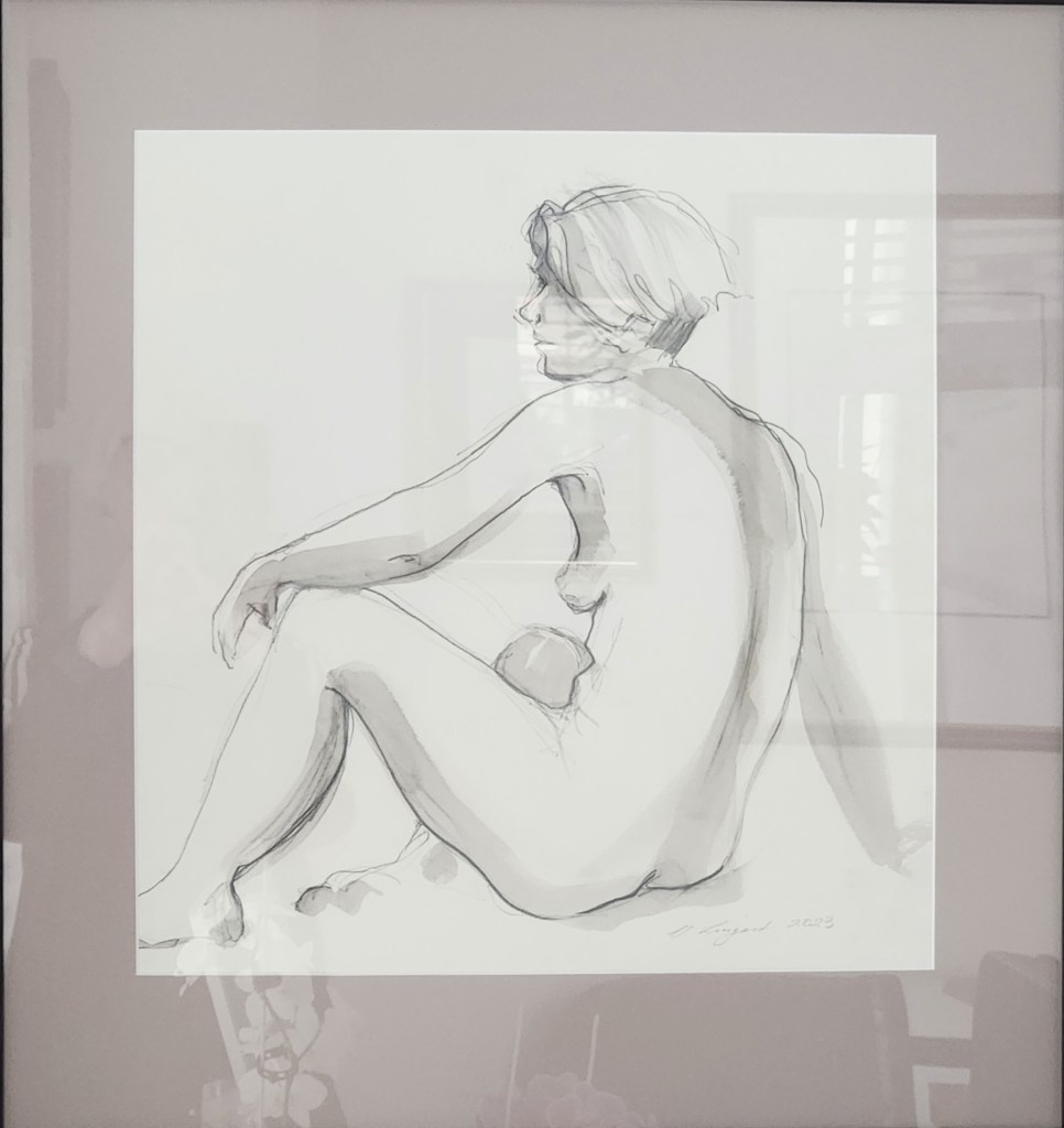
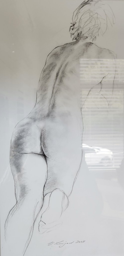
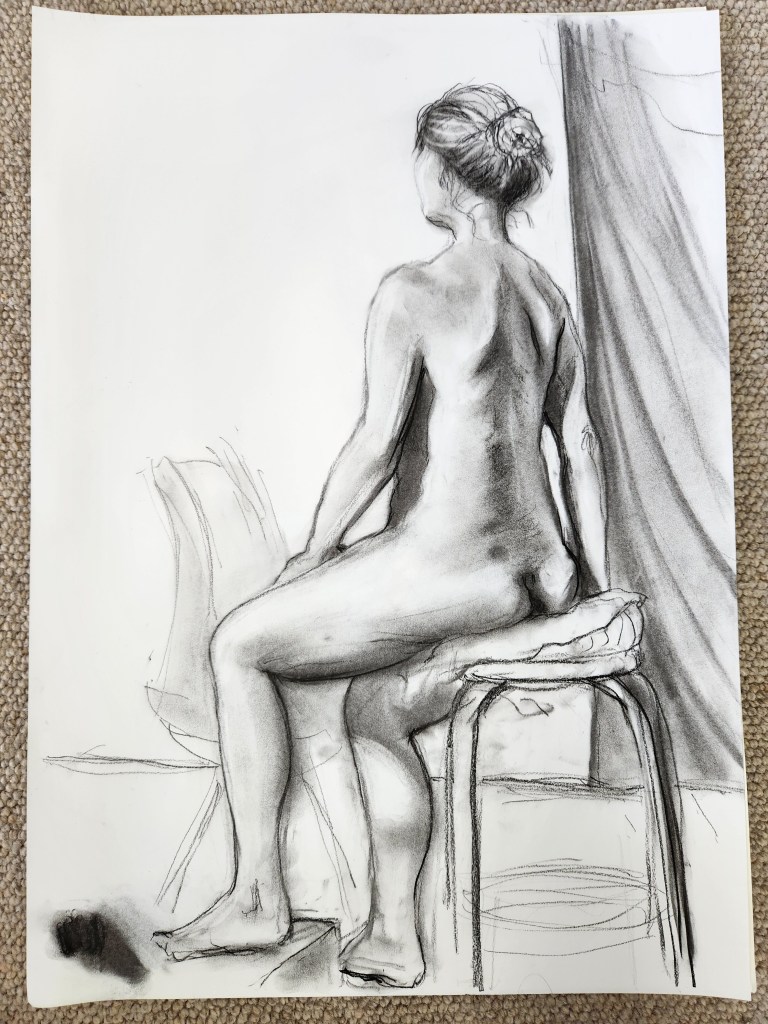
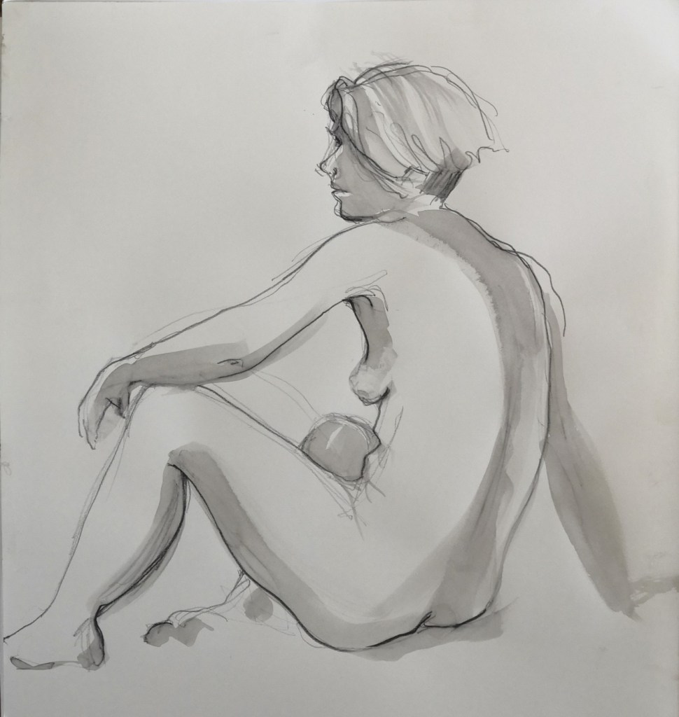
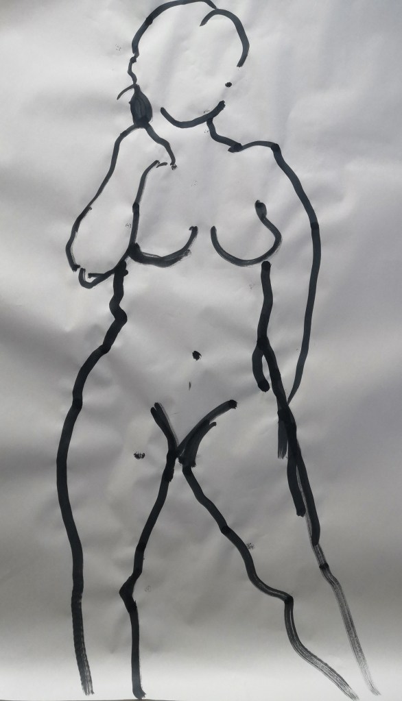
Just recently, I framed a nude sketch I had done some time ago (above), and hung it on my studio wall. Then, I decided to hang another nude sketch on an adjacent wall, swapping out the portrait which had previously hung there, (apologies for the glass glare on both). This activity was all it took to kickstart my return to work on my graphic novel, which had sat in the same spot for weeks on my drawing easel.
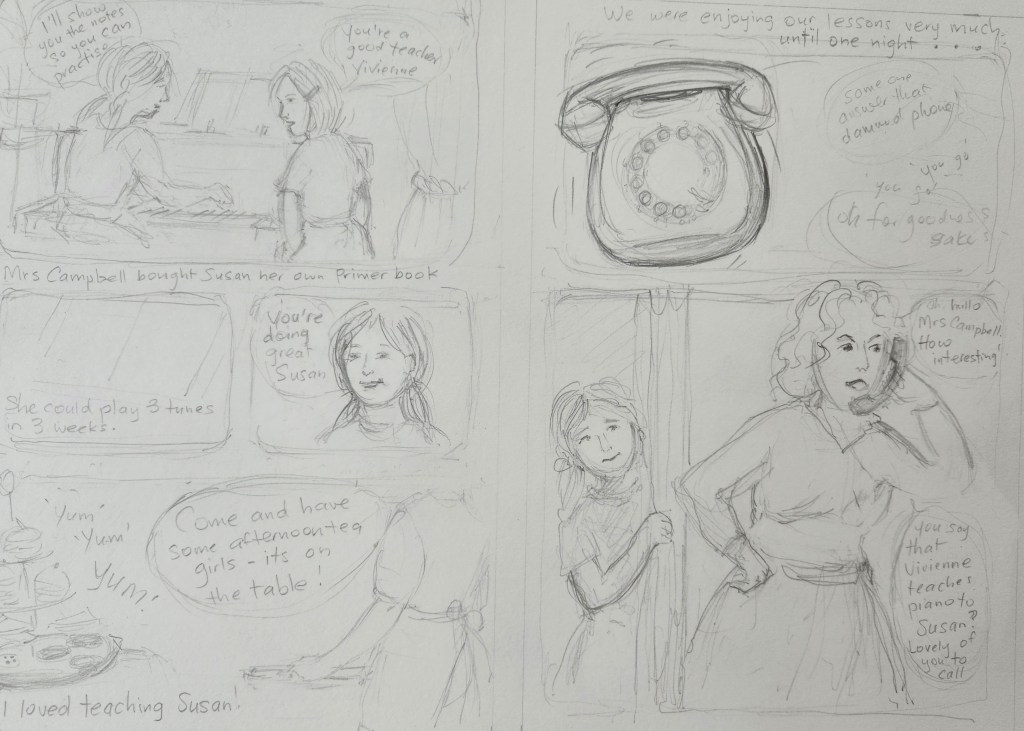
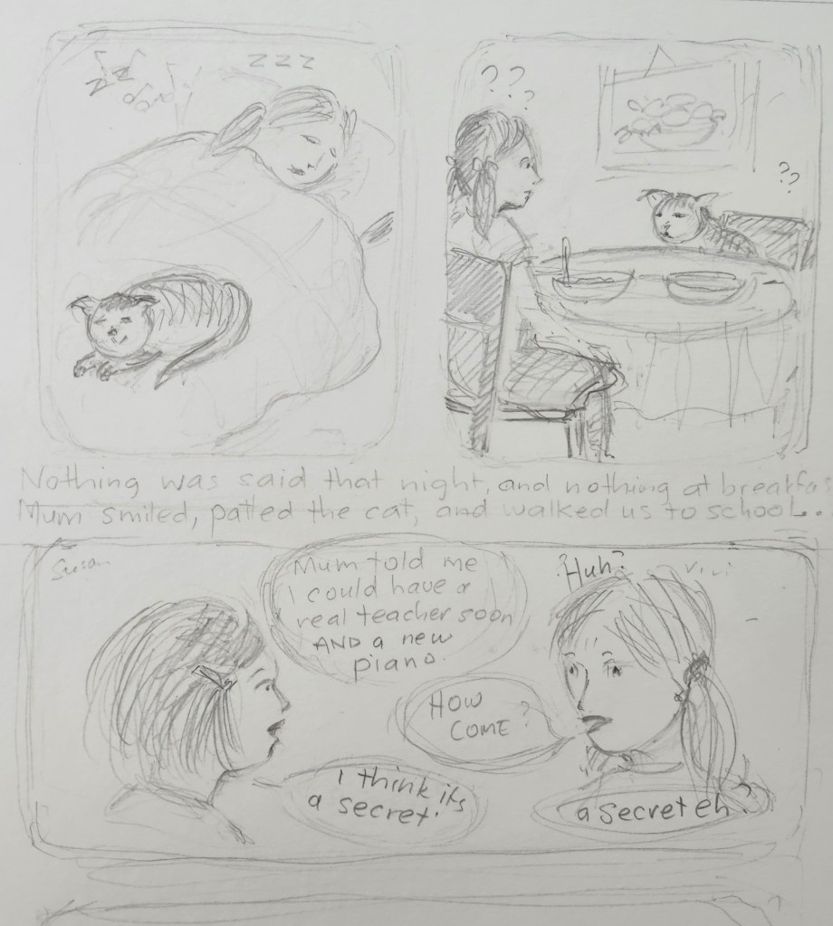
I started on the book yesterday, continuing with the section called Piano Teacher, which is about a girl who watches her brother go through his lessons with his teacher – badly. She, a rather bright child, picks up the hang of it all, and in turn offers lessons to a young friend of hers.
Hi to all. I do hope your Christmas break has been relaxing and you are once again immersed in your art, work, reading, or whatever moves you most. While our holidays are behind us here, there have been many disruptions to my intended outpouring of my art and writing project. I decided this week to give you some idea of why I’ve stalled on my most adventurous art project yet – a graphic novel. I decided to write myself back into this project, and here is some of what I wrote…
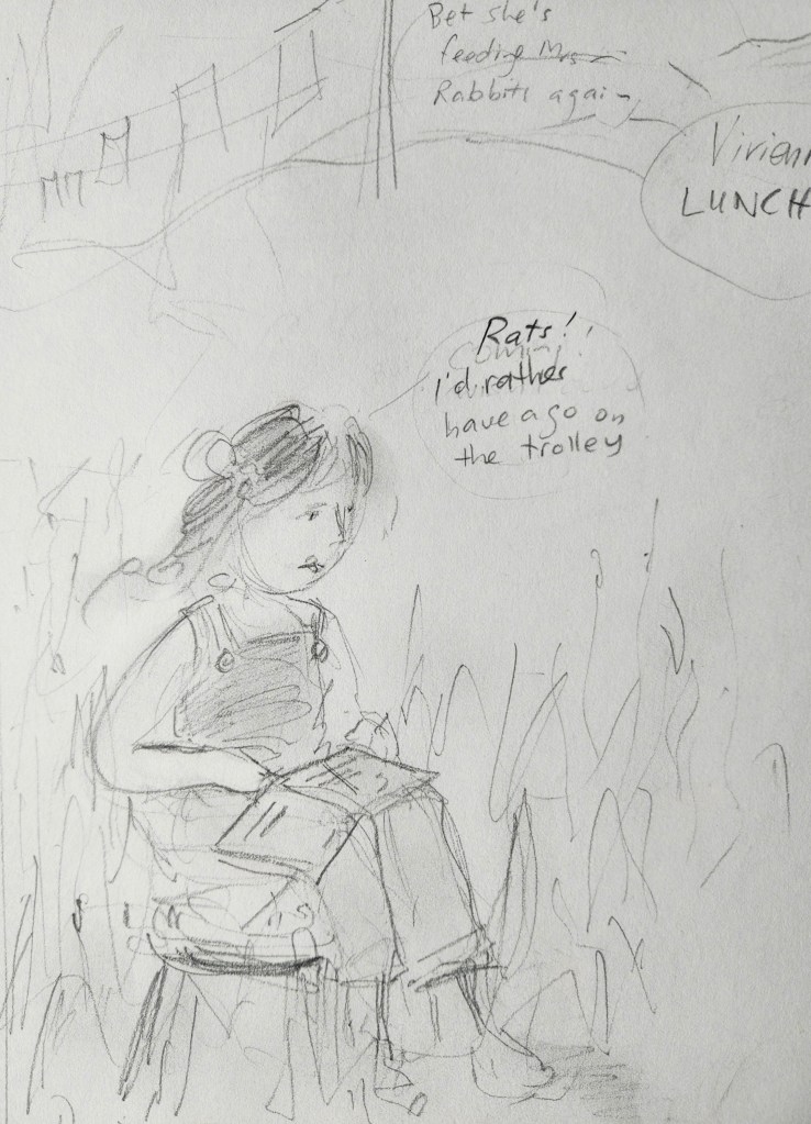
Last time I talked about my memoir with pictures, I showed a few pencil sketches of some pages I had nutted out. I have now sketched more pages, attempting to make a storyboard of the tales I wished to tell, or portray. This bit was easy. I love sketching in pencil and plotting scenarios based on my experiences when young, that was no trouble what so ever.
I studied other graphic novels to get a feel with how I wanted mine to look: a mixture of double pages in colour or black and white, and several pages with smaller images, as you might see in a comic, with speech bubbles etc., But then, I decided I should do at least one trial page in full colour as I imagined the larger pages should look. But, what medium to use?
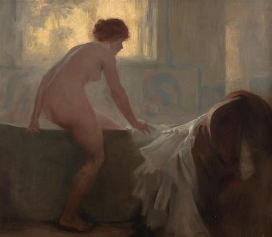
La Femme au Bain by René-Xavier Prinet, around 1888
The final class was cut short, as we were to be given a talk about the painting by Charles Goldie, which is where the classes began. To recap, we were handed a copy of the painting and were asked to copy it. But what I never realised until this talk was, that Goldie had copied his La Femme au Bain, from an original, for on the bottom of the painting it reads ‘after’ René-Xavier Prinet. Both artists studied at the Académie Julian in Paris around the same time. So, I had made a copy of a copy. I didn’t know what to think. I guess seeing both men could certainly paint, I must have learned something through close observation.
Last week I started to work on an invented background for my painting, as the room lacked ambience. Once home I spent some time trying to improve on the colours and build more interest to the painting as a whole.
First thing was to correct the position of the right leg. I was still struggling to get the thickness of my paint as I wanted, and it always seemed to come out too thin even with medium. Never mind I told myself, I can always let it dry and add more layers.
And so, that’s what I did. At least by the time I’d put the canvas aside I could say that I almost liked it. But there was a way to go.
Continuing on from last week, when I showed you the charcoal sketch (see above) which I would be transposing onto an A2canvas. As I am going to take you through that process I thought it would help to include it here as this is the pose I shall continue to work from.
Following last week’s effort, I thought a good deal about how I would approach the second class, realising there was a chance of not been offered any specific way in how to apply oil paints. I decided to progress my painting by instinct; it wasn’t as if I haven’t drawn from life, and although my painting history has revolved around fiddling with watercolour, I have used acrylics before. And, I do know a reasonable amount about colour, albeit using pencils rather than paint. During this session we were encouraged to go and view the original painting again. It was difficult to see the actual paint strokes as it was behind glass but we did agree the painting was lighter in tone and showed the colour more effectively than the photocopies we were working from.
On Saturday I attended my first of six art classes at the Auckland Art Gallery in painting the figure using oils. It’s been over twenty years since I last tried oils, and had all but forgotten what to do, so was keen to gain some new skills. The above image is the one the class was to attempt to paint from; presented to us in photocopied form, the colours even more subdued than the original image shows. We were also handed a slightly smaller version with a grid pattern superimposed. I looked at the grid, knowing it was often used for beginners learning to draw proportions. I hadn’t used one ever for sketching the nude. However, I was keen to do what everyone had been instructed to do, and set about marking up a piece of paper with the same grid proportions.
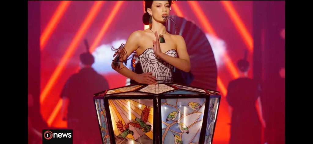
The World of Wearable art show is a New Zealand invention conceived by Dame Suzie Moncrieff, Nelson. The fashion extravaganza was shown in her hometown from 1987 until 1990, when its gathering popularity demanded a shift to the capital city, Wellington. WoW had become a phenomenon. In Dame Suzie’s words, she describes what WoW personifies for her:
“To take art off the wall and out of static display. To adorn the body in wildly wonderful ways. To celebrate creativity in a lavish and unique on-stage spectacular that will inspire us all.”
And inspire it certainly does, attracting entries from all over the world, which have audiences looking forward to the annual event with much anticipation and excitement. Especially this year.
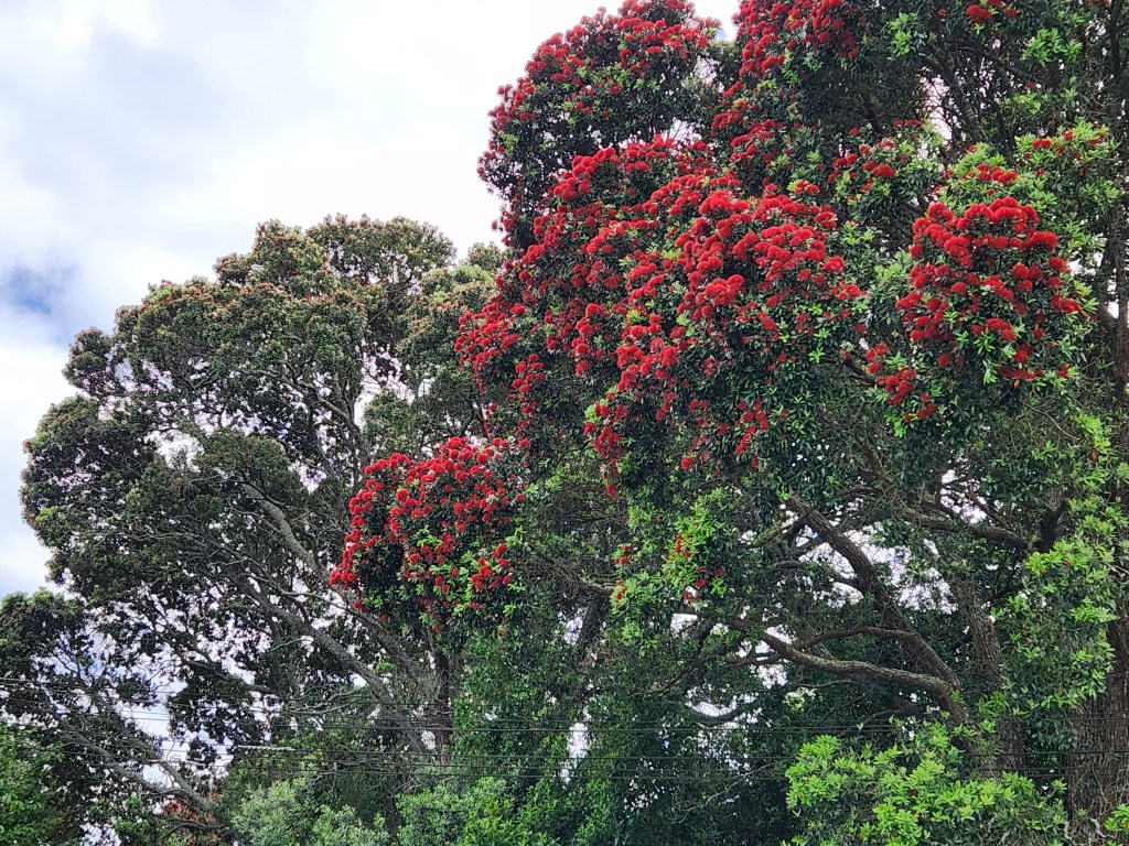
I have written a few times about our native Pōhutukawawhich we call our Christmas tree, because of its vibrant red blooms tipped in gold which look like decorations, and it always blooms around Christmas time. Last year the flowering was not so spectacular, but this December because of more constant rain, the flowering has been superb. Most of you who follow me will know that I have been working on a new novel, and have been writing like crazy to complete the first draft. It is almost there. So, before I embark on the last pages, I thought I’d relax with a little sketching. I have chosen to do a close-up sketch of emerging pōhutukawa flowers. Hoping it will look okay.
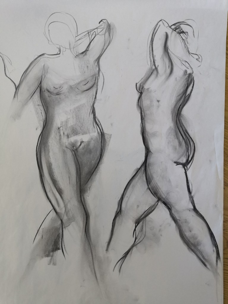
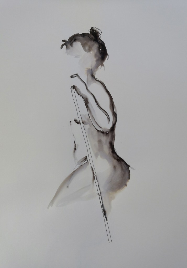
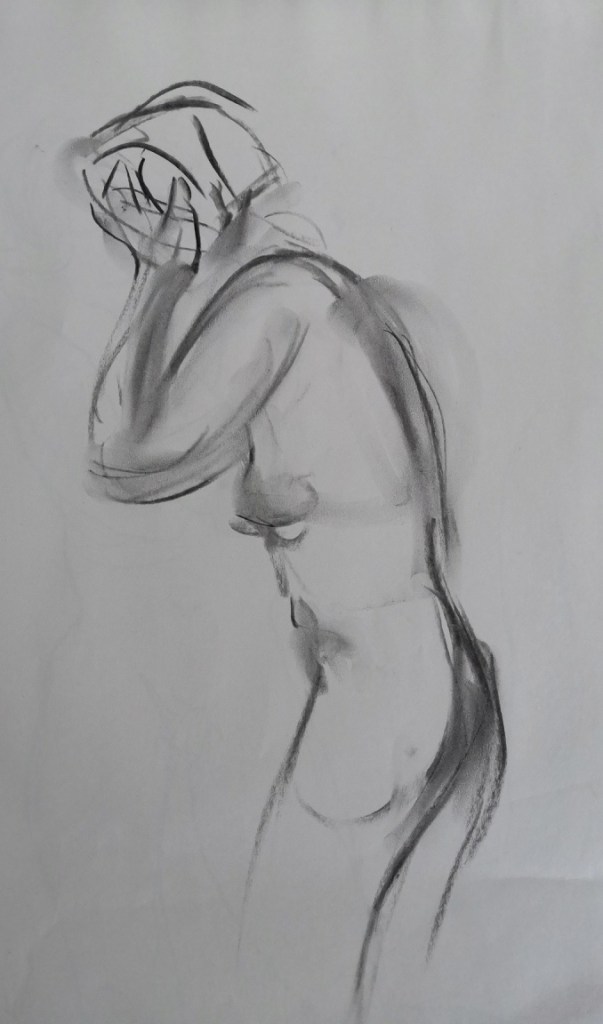
Nine weeks of life-drawing sessions have gone by in a flash and mostly my experiences were happy ones. I had hoped that we would repeat the charcoal (outside in) method of shaping the figure (see August 4 post), but no. I’m showing a few sketches I quite like from the last two classes. There are always reservations to what could have been done better, or differently, and the five images below show different mediums and time taken for various poses.
15 minute sketch: 6B graphite with diluted black ink/water wash on Hahnemuhle paper.
This seated pose came after a raft of fast ink sketches using a thick brush on newsprint, which I DO NOT enjoy doing. I was pleased when the longer poses came, and I switched to a lovely cream 140g Hahnemuhle paper, which works well with many drawing mediums and handles a light wash well.
I am talking about art classes and my sketches again. The previous week, I didn’t enjoy sketching using a paintbrush loaded with black ink on A1 sheets of newsprint.
I had, in the past only used paint with a brush that size on board, or heavy paper. Normally I would have sketched using a dry-brush effect. But that day, and many sheets of newsprint later, I knew that the combination of thick brush, ink and heavy application didn’t like me. Or, maybe it was me that was thick?
This week, we had the same model. Fortunately we began with charcoal. Ye ha! As stated before, I think charcoal works well on newsprint and its ease of use is perfect for fast poses. In fact, it glides across the page.
Better luck today I thought.
Two minute charcoal sketch with focus on line
I love the way you can move charcoal on the paper, and get very grubby fingertips in the process. It helps that we were using large easels and A1 paper, as it gives the arm room to move fast to catch the pose. It’s important to gauge the shape of the model and the spaces created with the pose. For example; the triangular shape between the stride, and the negative spaces created around the figure too. Using the paper’s edge as a guideline helps, as you visually judge the distance between the shape and the straight edges. Then it’s look/sketch/look/sketch… until the time is up.
More charcoal, aiming for line and moulding the form.
It was suggested we lie our charcoal stick on its side for the next sketches, and I did attempt one of two with varying degrees of success. But that is to be expected, when the pace is fast and you are presented with doing something in a different way from usual.
It is my natural inclination to sketch line before moulding the figure, and these were a combination of the two.
I didn’t think you needed to see the bottom half of the page. Nor the drawing which followed, where the proportions were off.
And then, it was into line again!
Two minute charcoal sketch
Gosh, I was spinning, as next we were onto ink sketches, using our implement of choice for a fifteen minute pose. Ha!I I chose my trusty pen with a long refill cartridge and sketched wildly. I decided to add colour wash near the end and duly applied it with a size 7 brush. Oh no. I hadn’t realised I had the soluble ink refill in my pen, so I quickly left that sketch alone, knowing I could work on it at home. Onto another fast pose to get at least one ink sketch done…
Very quick sketch using water-soluble ink, with light water wash
I like using this ink, if I’ve remembered it’s in the pen! The line is more forgiving, as it is made movable by the water brushed on. The water does need to be used sparingly for best results.
All in all I had a very enjoyable morning. Next week, I hope we’ll get to use some colour again, as it is the penultimate life drawing session.
Wednesday was art class day, and I really should have stayed home. Not because I did bad work, which was surprising as I’d hurt my back and felt very under par. But, since I had been enjoying the classes so much, I headed down to the ferry at 9am. It was on time, which meant I could easily make the early bus from the waterfront up to the art school. That bus never came, and I arrived late to class. The studio door was shut and a notice said KNOCK BEFORE ENTERING. My tutor greeted me grumpily, and then, I needed his help to erect the large easel (grovel, grovel). It took me ages, to collect paper, peg it to the board, and get out my drawing gear, which meant there were just a few seconds left to sketch the first pose. “Try and capture the model’s emotion,” the tutor said. I think I captured my own splendidly.
More from Life class. This time our model was in costume, a là Charlie Chaplin: black top, pants, a boater and long cane. Her point of difference were blue socks and Doc Marten shoes. We didn’t use willow charcoal to start this time, although we were to sketch on A1 sheets of newsprint as usual. A 6B or softer was the order of the day, and contour was the expectation. I loved the way the model had a good sense of her body and how to place it. She stood for the first half of the class, and we began with short poses. The idea with the first sketch was to try and keep the pencil on the paper and make as few lines as possible to form the figure. Our tutor is keen on putting pressure on the lead, so the line is as dark as we can produce. My instincts are for a softer line, but I was keen to try something different.
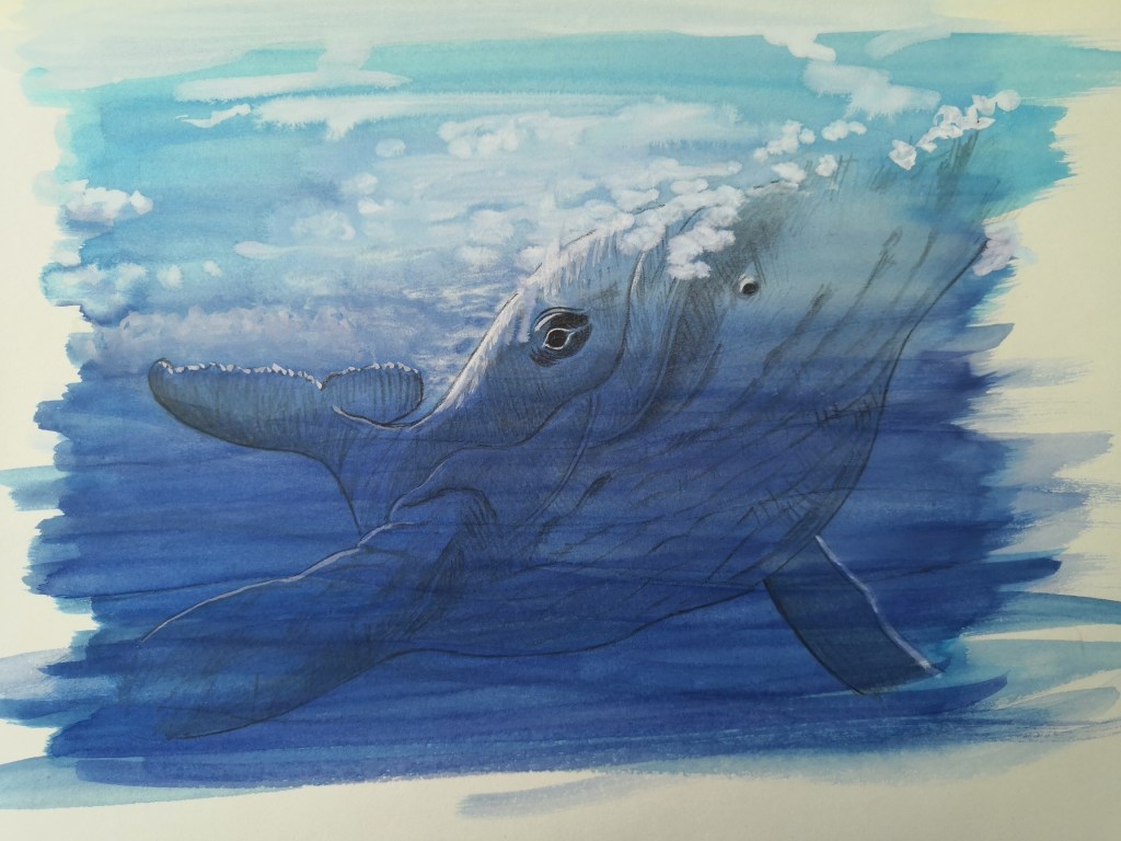
Some years back, and before writing took hold of me, I illustrated several children books. One was Save Our Seas, by author Maria Gill, who tells a story about the marine environment in New Zealand, based on logbooks from Sir Peter Blake’s New Zealand voyages. I was especially pleased to be asked to illustrate this book, as I love wildlife. And I had around fifty separate illustrations to do.