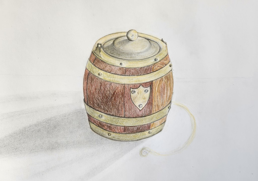
Last post I was dealing with a crook back. Improving now, thank goodness. I was also recovering from a cataract operation, and that I found even less conducive to looking at a screen for writing, or a sketch pad for sketching. However, I can exercise again, and can see without peripheral bright light flashing, finally enabling me to do the post I’d planned. For two or more weeks I’d thought about drawing this old wooden barrel, which is a perfect container for loose tea. It did start its life as quite a different object which I’ll get to by and by.
An expression meaning many things, but here I use it literally. The past month is almost a blur, with a second trip to Australia to see the youngest daughter, who lives some way out from Brisbane. I had in tow her sister and brother, he from Melbourne, she from Dunedin and me, Mum from Auckland. That explains my busyness, and lack of posts. It doesn’t explain my latest blip which was putting my back out, and although I have been doing regular exercise, I also need to sit down more. Perfect for getting a sketch done!
This is my second attempt to sketch and write a blog this week, the first effort was not great – more wilting lilies. So, I decided to draw a fantastic tree for which Devonport (where I live) is quite famous – the Moreton Bay Fig. This large evergreen tree of the Mulberry family happens to be native to Eastern Australia. Lucky Devonport has many of these fabulous giants based around our library. They are so big they almost straddle the road, and I always stop and admire the amazing root systems which have tourists clicking their cameras. I became the tourist this day and took a photo while out walking. This will make a nice art project I thought.
Half-way
I started sketching using a water-soluble graphite pencil, which has a nice thick, soft lead. My idea at first, was to make this a tonal wash sketch, using different techniques. I have tried using a white blockout lumocolor before, when there are considerable white spots in the texture in tree trunks, and would be too fiddly to leave so many bits of white paper showing, as I usually do. The blockout has worked well when I’ve used a straight watercolour wash. However, it doesn’t work that well with the water soluble graphite (for me anyway), as it leaves residual grain. So, I left the work to dry, and then tried to erase the extra pigment which had penetrated the white blockout. So now my work looks grubby, which is not unusual when I try using water! Never mind, the watercolour paper is 33gm Hahnemühle and can cope with heavy treatment.
Finish
I was reasonably happy with the top sketch but could see I had missed the proportion somewhat bottom left and top right. I did adjust that, and feel it is better. I also used a clean Staedtler eraser to lift off some of the unwanted tone. Done. But now, my task was to work more texture into the sketch, and to add limited colour. I used an 8B graphite pencil (not a water-soluble one) for the extra texture on the tree, colour pencil for the moss and the smattering of leaves. My conclusion is that maybe it’s okay to enjoy these magnificent trees while out walking, and forgo the urge to draw them – just saying.
Nine weeks of life-drawing sessions have gone by in a flash and mostly my experiences were happy ones. I had hoped that we would repeat the charcoal (outside in) method of shaping the figure (see August 4 post), but no. I’m showing a few sketches I quite like from the last two classes. There are always reservations to what could have been done better, or differently, and the five images below show different mediums and time taken for various poses.
15 minute sketch: 6B graphite with diluted black ink/water wash on Hahnemuhle paper.
This seated pose came after a raft of fast ink sketches using a thick brush on newsprint, which I DO NOT enjoy doing. I was pleased when the longer poses came, and I switched to a lovely cream 140g Hahnemuhle paper, which works well with many drawing mediums and handles a light wash well.
Wednesday was art class day, and I really should have stayed home. Not because I did bad work, which was surprising as I’d hurt my back and felt very under par. But, since I had been enjoying the classes so much, I headed down to the ferry at 9am. It was on time, which meant I could easily make the early bus from the waterfront up to the art school. That bus never came, and I arrived late to class. The studio door was shut and a notice said KNOCK BEFORE ENTERING. My tutor greeted me grumpily, and then, I needed his help to erect the large easel (grovel, grovel). It took me ages, to collect paper, peg it to the board, and get out my drawing gear, which meant there were just a few seconds left to sketch the first pose. “Try and capture the model’s emotion,” the tutor said. I think I captured my own splendidly.
More from Life class. This time our model was in costume, a là Charlie Chaplin: black top, pants, a boater and long cane. Her point of difference were blue socks and Doc Marten shoes. We didn’t use willow charcoal to start this time, although we were to sketch on A1 sheets of newsprint as usual. A 6B or softer was the order of the day, and contour was the expectation. I loved the way the model had a good sense of her body and how to place it. She stood for the first half of the class, and we began with short poses. The idea with the first sketch was to try and keep the pencil on the paper and make as few lines as possible to form the figure. Our tutor is keen on putting pressure on the lead, so the line is as dark as we can produce. My instincts are for a softer line, but I was keen to try something different.
This week, the group were asked to focus on line rather than form for the quick sketches. I was working on A1 newsprint, pinned to board on a painting easel. This was a rather different approach from the previous class, where I sat straddled on a wooden artist’s Donkey. In that situation I could rest my arm when I chose. With all the poses for this week’s work, I was standing, using the arm and fingers stretched and moving the mediums quickly on the page. The first sketch is in the middle, superimposed by the blue pastel sketch, and last, the pencil sketch of the seated model. We did several more quick poses, using charcoal until the break.
Yes, a continuation of the sea creatures I illustrated for the Save Our Seas book I wrote about three posts back. To recap, I was asked to sketch cartoon characters, paint small scenes, draw a myriad of sea creatures, and a few coastal scenes.I have chosen not to put all the remaining images in here, as it would make the post too long, but I hope you like the cross-section of artwork I’ve selected for this one.
This week thought I’d show you some illustrations from the other book I mentioned last week – Eco-Rangers Save The Planet: Earth-friendly missions for green kiwis, written by children’s author Maria Gill. This book is A5 size, and could be slipped into a back pocket. It’s full of ways young people can think about the their environment and finds ways to keep it healthy. I was asked to draw the two main characters first, and make the boy and girl a bit funky. The book was aimed at young teens, so I looked through a great Taschen book on recent illustrations to get an idea of styles. My work would be grades of back on white, with green and blue being the background print colours.
While walking, on the lookout for something I could sketch, I looked no further than the sky. It was both fantastic and rather terrifying, as the brooding clouds looked ready to empty their heavy load on me. So, before the anticipated deluge I took a photo, and continued on my walk, expecting to find myself racing for cover at any moment. Weirdly, those clouds kept on brooding and finally wreaked havoc in the middle of the night. Wind thrashed the trees, streets, and whipped up the sea, but our region was relatively unscathed, fortunately. Not so, further out west where floods drowned cars and wrecked homes and businesses.